I recently took an Uber to the airport. The Uber driver, who owned a Tesla, looked at me when I got inside and said “You’ve been in a Tesla before haven’t you?” I replied that I had, but was confused about how he knew that. It turns out that he can tell based on if people can use the door handle.
I remember the first time I tried to open a Tesla door… it was miserable. I didn’t know how to do it. I felt stupid. It took a lot of practice to be able to do it effortlessly with one hand. To this day, I still think it’s a poor design because of the lack of affordance.
The best user experience (UX) is the one that goes unnoticed. It’s opening your fridge door. It’s a pen that works when you need it. And when it comes to data security, it’s little to no extra steps added to your workflow.
Seamless UX Has a Domino Effect
When you put great UX out there, a domino effect happens. There’s less confusion using the product. There’s no training needed. There’s a quick and vast adoption of the product. There’s a reduction in support tickets. There are fewer under-the-table workarounds, too.
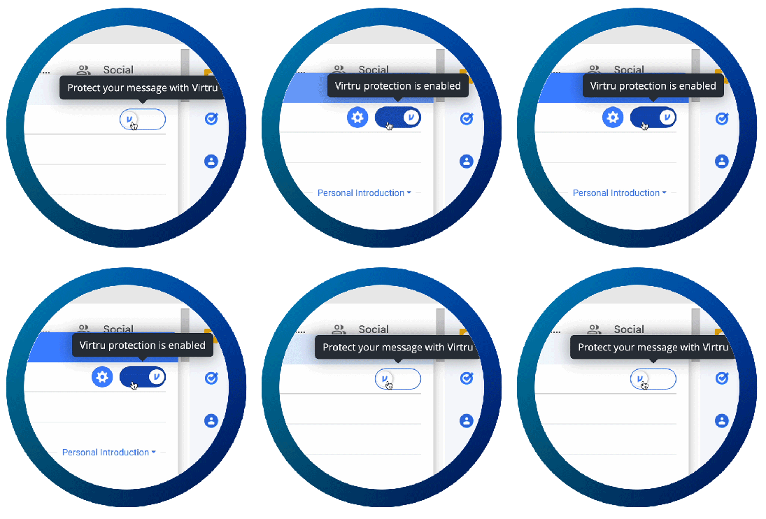
This is how Virtru for Google Workspace works, specifically in Gmail. A recipient quickly clicks a button to encrypt an email they want to protect, and all of the attachments within it. There’s no learning curve, it’s intuitive.

When your product can do what it set out to do without disrupting the end user’s life, that’s when you’ve succeeded. The dominoes fall into place not only from a workflow perspective but from a business perspective as well.
Less time focused on teaching end users how to encrypt and decrypt data means more time focusing on doing work that matters most to your business. Less effort spent by end users typically means fewer attempts to subvert the security tool - which ultimately reduces the threat of compliance violations and costly data breaches.
Noticeable UX Should Be Strategic to Make an Impact
There are exceptions to invisible UX, of course. Sometimes there’s a need to be noticed to make an important decision or to warn the user about something. It might not be pleasant, but it’s effective. (Fire trucks, anyone?) To be effective, these moments should happen infrequently and strategically.
There’s a reason that Virtru uses red text or buttons very rarely: We aren’t trying to alarm someone who is just trying to get their job done unless there’s a legitimate risk. In those times, it’s important to draw attention to something. This helps people who use our products know that we will take care of them if something needs their attention.
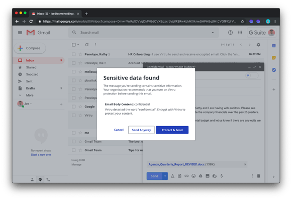
Virtru’s Data Loss Prevention (DLP) feature illustrates this. Regex or AI detectors sniff out keywords and recommend information that needs protection. This is vital in scenarios where Protected Health Information (PHI) or financial information is being transmitted via email. When Virtru’s DLP detects that sensitive information may be leaving your organization undetected, it warns a sender to activate encryption to meet compliance and protect sensitive data.

The Best UX May Not Always Be Noticed, But It Is Felt
The best UX goes unnoticed, but there are times when you want people to notice the experience in a way that’s positive, and emotional. Maybe the small things aren’t noticed, but how you feel is evident by the end of using something with good design. You feel secure, confident, happy, relaxed, or a combination of these things.
If you never think about the experience besides feeling a positive glow after using it, you’re likely using something that has been thoughtfully designed. The most minimalistic and instinctive products are the ones that are hardest to design.
As designers, we channel a great deal of effort, from researching people’s desires externally to creating the perfect team atmosphere internally, but you don’t have to worry about any of this. Your employees can just seamlessly do what they came to do, securely.
To learn more about how Virtru's smooth and low-effort user experience can make a difference in your data protection journey, book a demo with us.


